new user flow
zenbusiness project
The ZenBusiness ‘new user flow’ team was tasked with coming up with variations of our new user flow to increase conversion.

overview
key responsibilities
- Identify pain points and challenges users face with the current interface.
- Create wireframes and prototypes to visualize and test potential solutions.
- Iterate on design concepts based on feedback and usability testing results.
- Plan and conduct usability testing sessions to gather feedback on the proposed interface.
- Analyze test results and make necessary adjustments to improve the user experience.
my role
product designer
collaborators
- Caitlin Moore - content designer
- Nelson Hsu - product manager
- Elizabeth Marks - ux researcher
Zenbuisness presents an easy to understand solution to setting up an LLC. Whether it’s your first business, or your 100th, the LLC formation flow should be easy to navigate and understand. The current new user flow (from when the customer clicks into the website to start a new business, to selecting a package) is convoluted and hard to compare different levels of service/packages with one another.
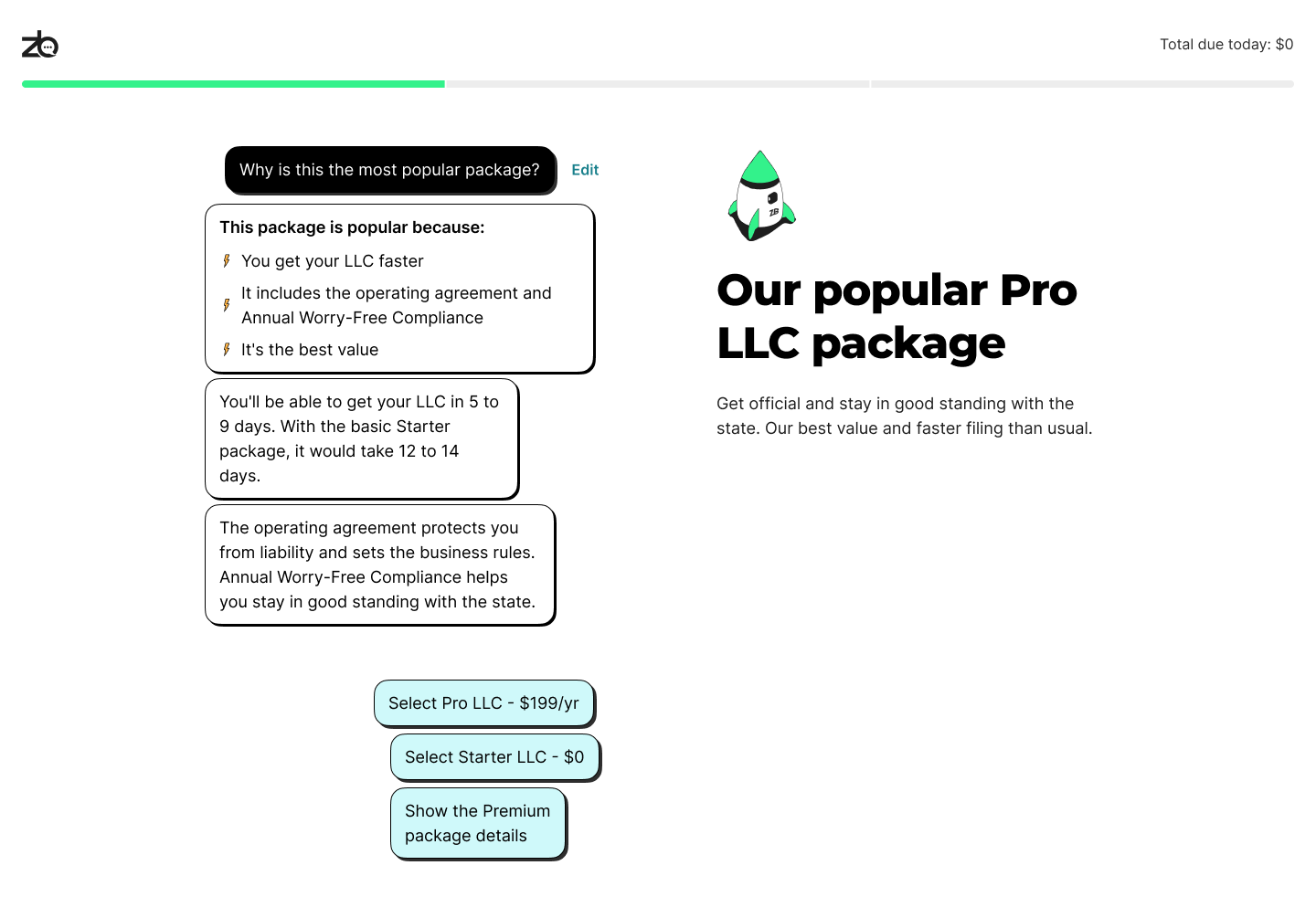
The ‘Pro’ package was the overall most recommended package by ZenBusiness, but not the most selected. We need to adjust the way information is laid out in the flow in order to more explicitly suggest the most recommended package.
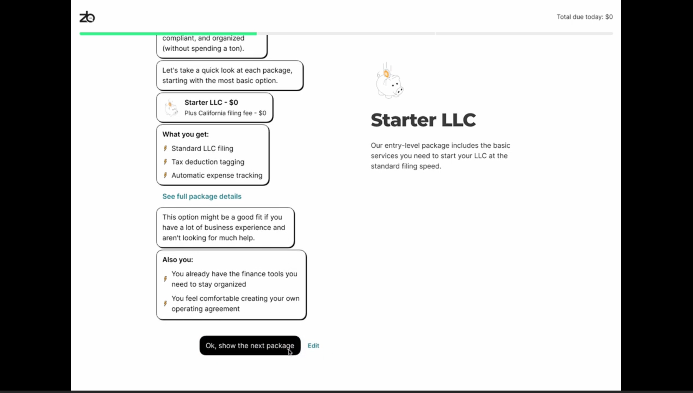
The first presented option would elaborate more on what kind of user is best suited to each package, hopefully guiding users to find their best suited package and increasing the take-rate of the pro package.

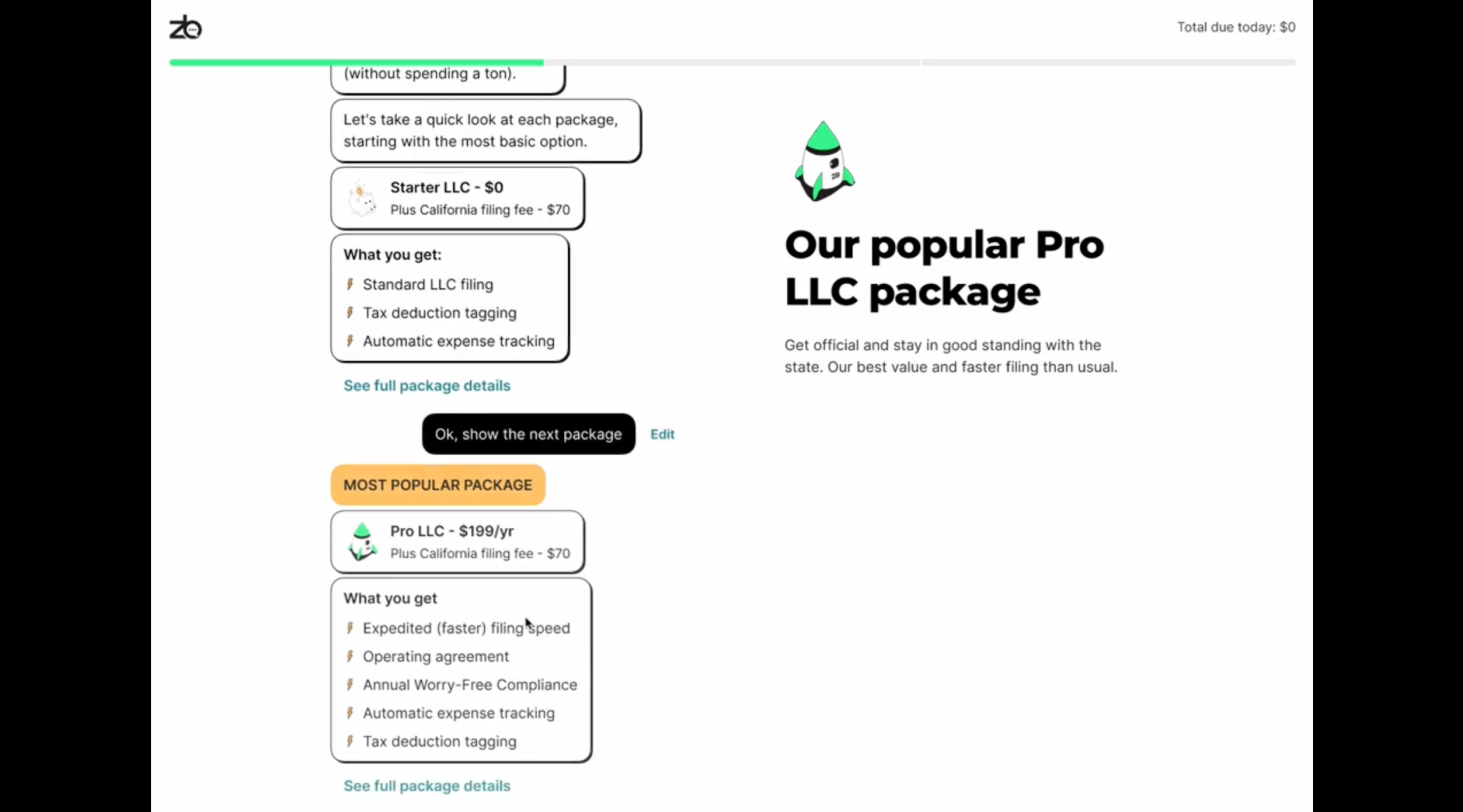
The second package test was to test presenting the package options sequentially, from lowest to highest. The control funnel presented Pro, Starter, Premium. The Sequential test presented Starter, Pro, Premium.

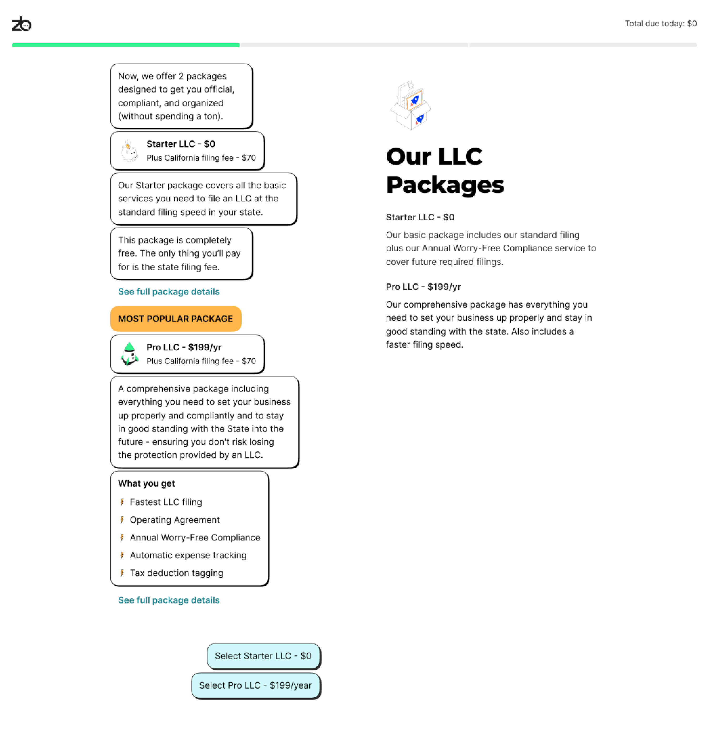
The final package test was to test only presenting two packages, the starter and pro, and eliminating the 3rd ‘premier’ package.

Each of the 3 tests that we came up with, tested positively over the control test, making any solution a viable option to be implemented. As an overall result, there was an increase of 20-40% take-rate on the recommended ‘pro’ package, and most importantly users were still easily able to choose the right option for them.
