intersections visuals
cisco project
I was tasked with creating the visual language for the CiscoIT Design department’s employee organized event, Intersections.
overview
key responsibilities
- define event voice and purpose through visual components
- create brand identity for internal online event
- deliver poster and other assets for event promotion
- deliver assets for online conference use
my role
visual designer
Intersections, an employee created event/conference with daily events needs a brand to be used to advertise and market the event to employees and attendees. The goal of Intersections is to provides space through a series of events that speaks to what kind of innovation can happen at the intersections of different things, like art and technology.
In order to aptly define the visual look for Intersections, we firstly needed to understand what Intersections was. Through collaboration with fellow event planner volunteers, we defined Intersections as an adventurous, bold attempt to explore what can happen at the intersection of different themes, like art and technology, and what can happen when we implement purposeful playtime into our every day routine.
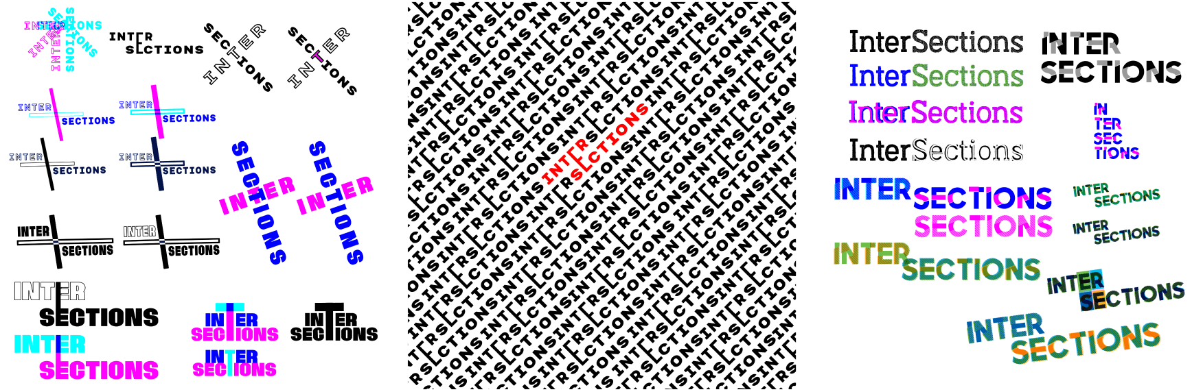
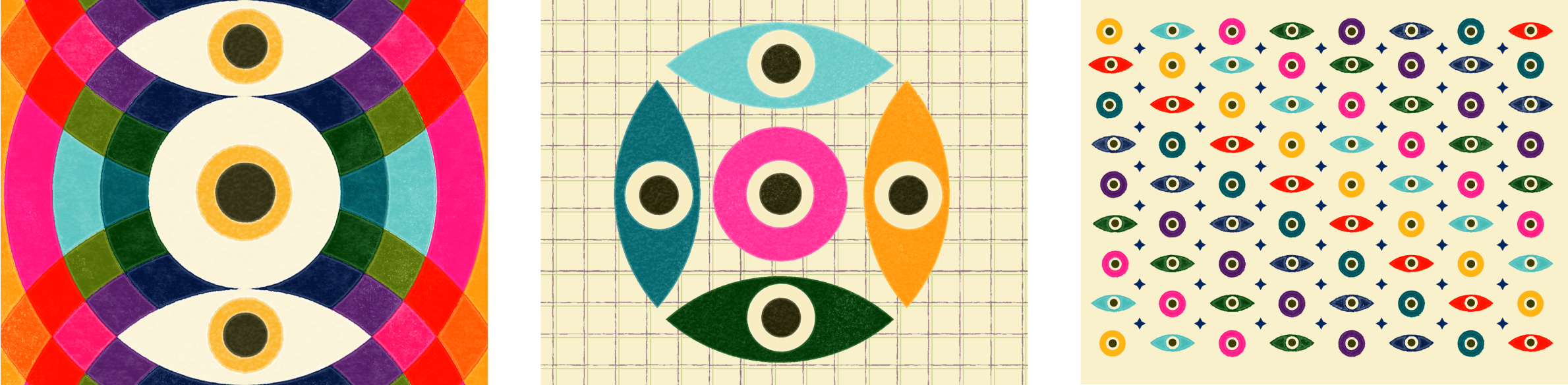
My first attempts at approaching the visual solution for this problem was trying to combine different textures and words to visually play with the word ‘intersections’ and what it means. I was specifically drawn to color and what happens when colored shapes interact as a visual representative of what can happen when different worlds intersect.
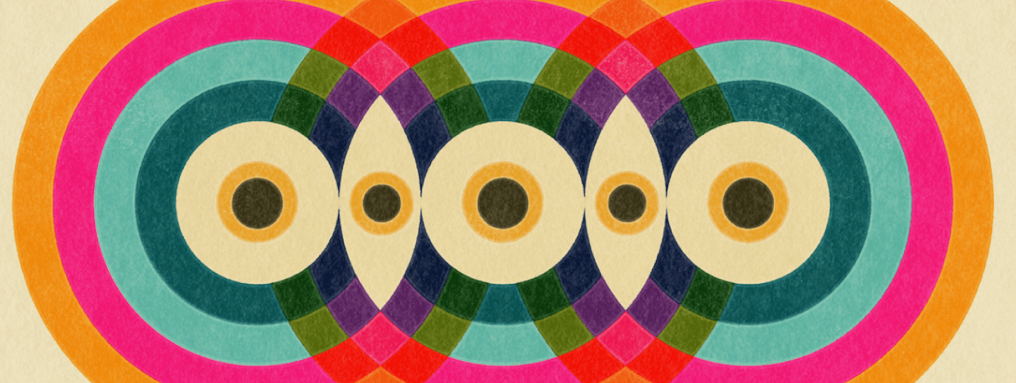
I delved deeper into the concept of intertwining colors and shapes, creating a harmonious fusion that generates new and unique forms. This exploration was inspired by the profound notion that when diverse backgrounds and expertise converge, they collectively contribute to the creation of something entirely novel.
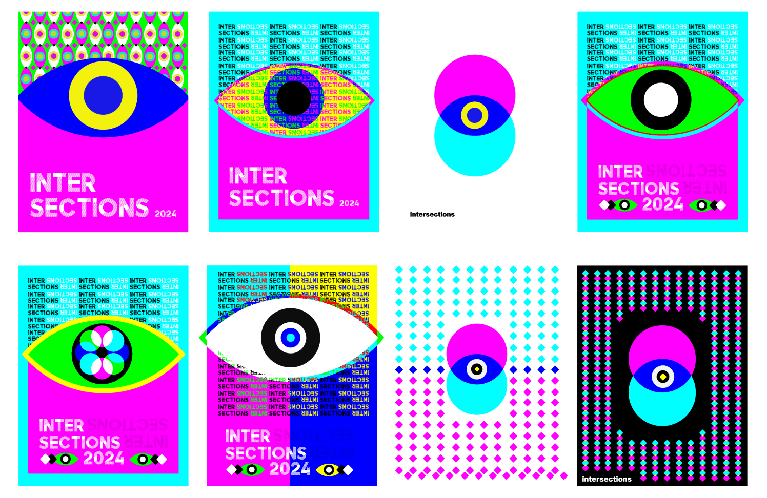
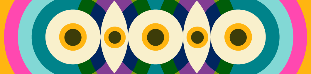
The final solution is colorful, energetic, and fun. It uses colors and shapes to visually represent the different themes of the event. For the type, I kept it simple as to not overpower the graphics. When circles overlap, they create new shapes and colors and the visual solution relies on these motifs and colors to represent itself.
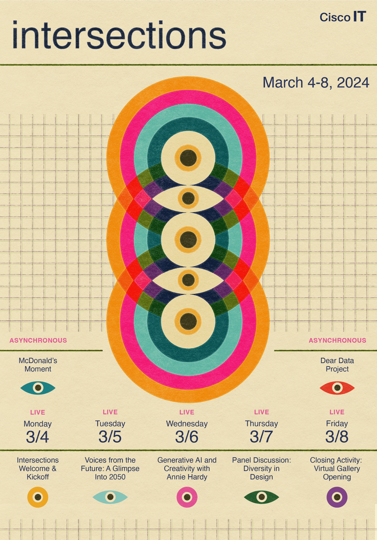
A logomark was created to simply reflect the visual brand created for use in advertising and internal branding. Colors, shapes and gridded lines represent the core elements to this visual identity.
The Intersections event unfolded seamlessly, leaving attendees enthralled by the meticulously crafted visual language that captivated them in the lead-up and during the event itself. The enthusiasm was so palpable that many chose to print out the poster, adorning their offices with a vibrant reminder of the unforgettable experience that Intersections offered. It was truly a delightful endeavor to be part of this project.