empty states
cisco project
The visual design team at Cisco IT was tasked with coming up with a set of empty and error state illustrations to use within Cisco internal products.
overview
key responsibilities
- Collaborate with UX designers to define user flows that lead to empty and error states, considering various scenarios.
- Create visually appealing and clear illustrations that effectively communicate the concept of empty and error states.
- Ensure that the design aligns with the overall visual language and branding of the product.
- Work closely with UX/UI designers to integrate the illustrations seamlessly into the overall design of the interface.
- Ensure that the illustrations are accessible and considerate of users with different needs, including those using assistive technologies.
my role
visual designer
illustrator
collaborators
- Laura Worrick - design manager
- Haley Little-Savage - visual designer
- Steven Pius - visual designer
The visual design team undertook the challenge of conceptualizing empty and error states for pages across Cisco IT products. Collaborating closely with product designers, we identified the areas requiring specific types of empty states to best serve user needs. Our team crafted and illustrated these empty/error states in alignment with the Cisco illustration guide, ensuring a seamless user experience throughout the interface.
For the ‘restricted access’ empty state, we needed an illustration that would represent something inaccessible to the user.
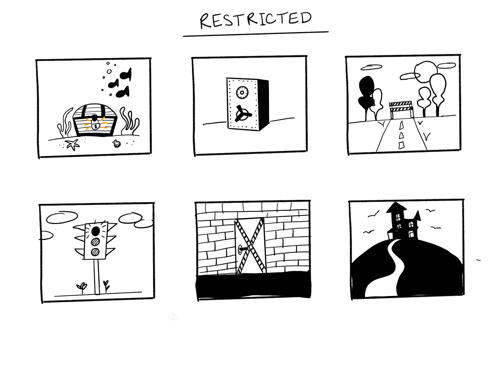
From our brainstorming sessions emerged a variety of initial sketches exploring concepts for the restricted error state. Among these, the depiction of an underwater treasure chest resonated with us the most. Its playful yet approachable nature struck the perfect balance, ensuring the error message remained engaging without being overly menacing or off-putting.
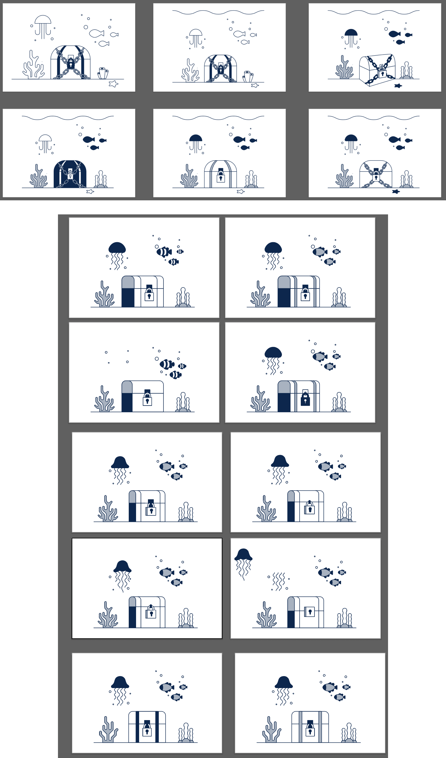
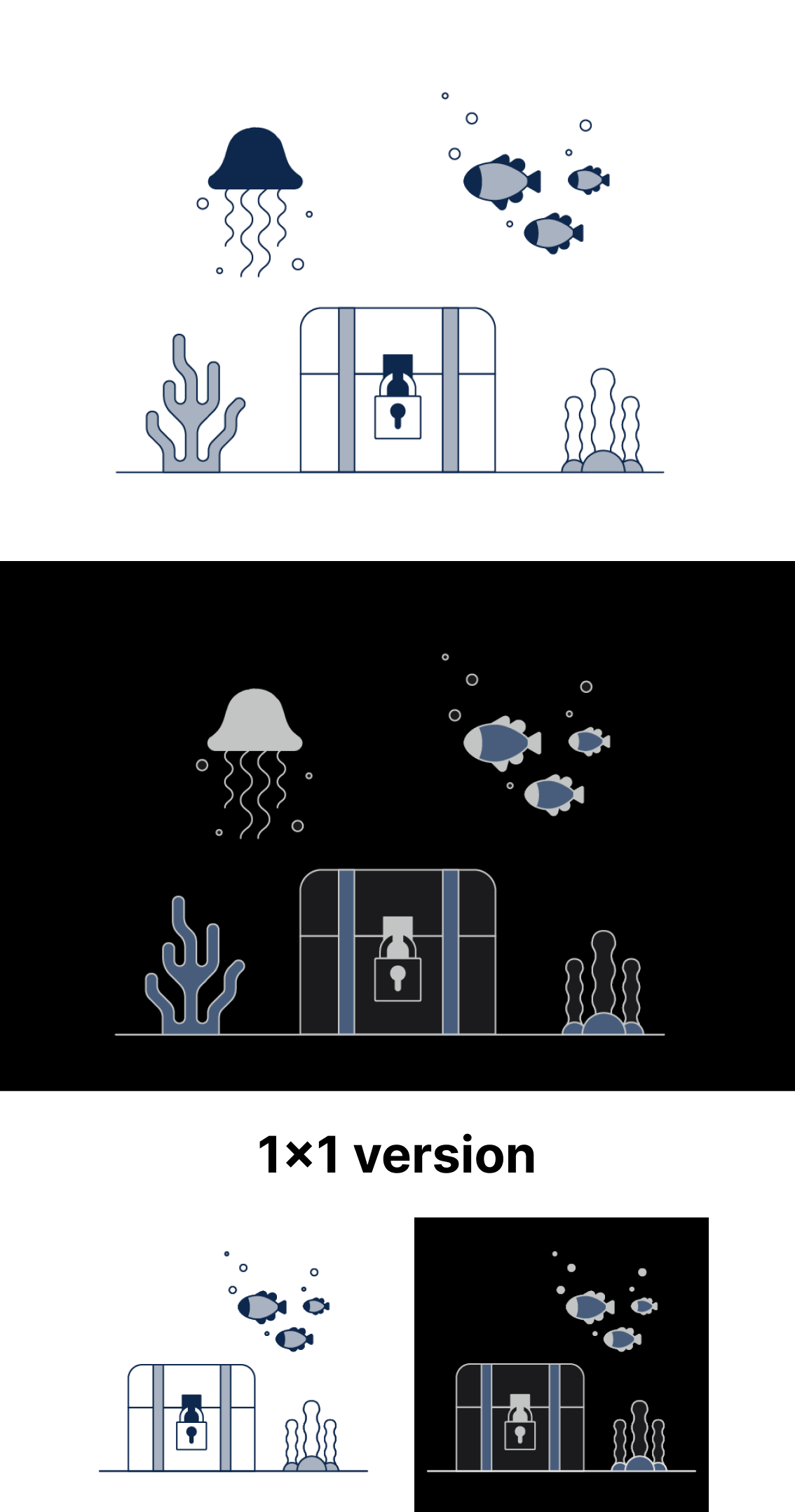
The final illustration is fun, clean and concise. We also created a dark themed version for future dark theme uses across our products and a 1x1 mobile/small version of the illustration.
The ‘under construction’ empty state would show up when a page in inaccessible because it is still being built or refined.
The preliminary thumbnail sketches tried to express something being built, or disconnected or not quite done. Some initial ideas included a crane building a webpage, broken cogs in a machine, and a toolbox.
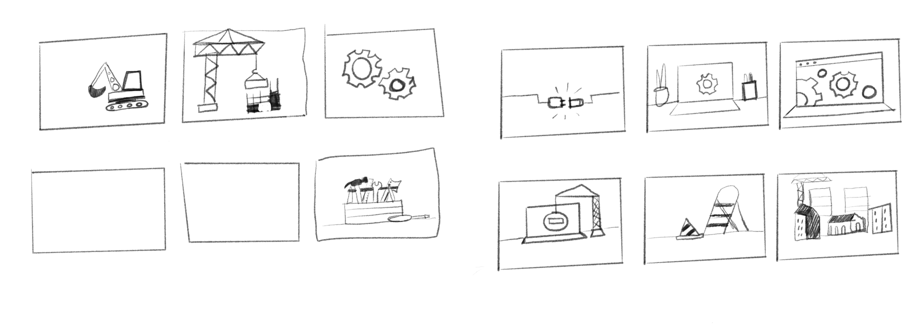
The preliminary thumbnail sketches tried to express something being built, or disconnected or not quite done. Some initial ideas included a crane building a webpage, broken cogs in a machine, and a toolbox.
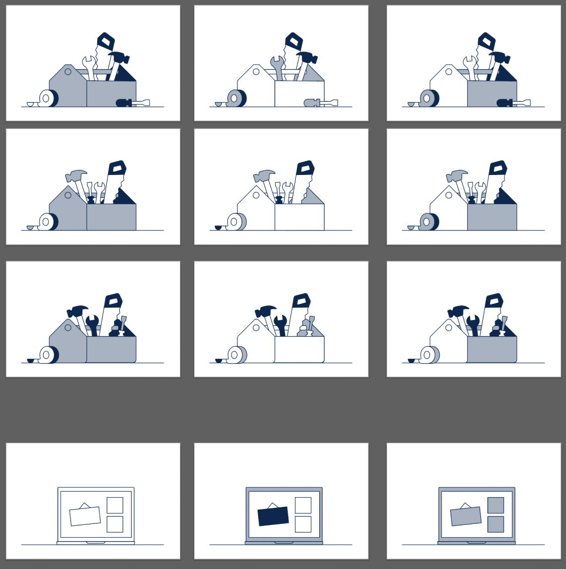
The tool box was the winner here, we played with color to conceptually match the rest of the illustrations and created a dark themed version as well for future use in a dark theme.

The ineligible empty state arises when users attempt to order a new computer, yet they are currently ineligible or it's not the appropriate time for them to do so.
The initial rough thumbnails for this concept delved into a spectrum of ideas, ranging from straightforward loading screens to more intricate scenarios such as being deemed too short to ride an amusement park attraction.
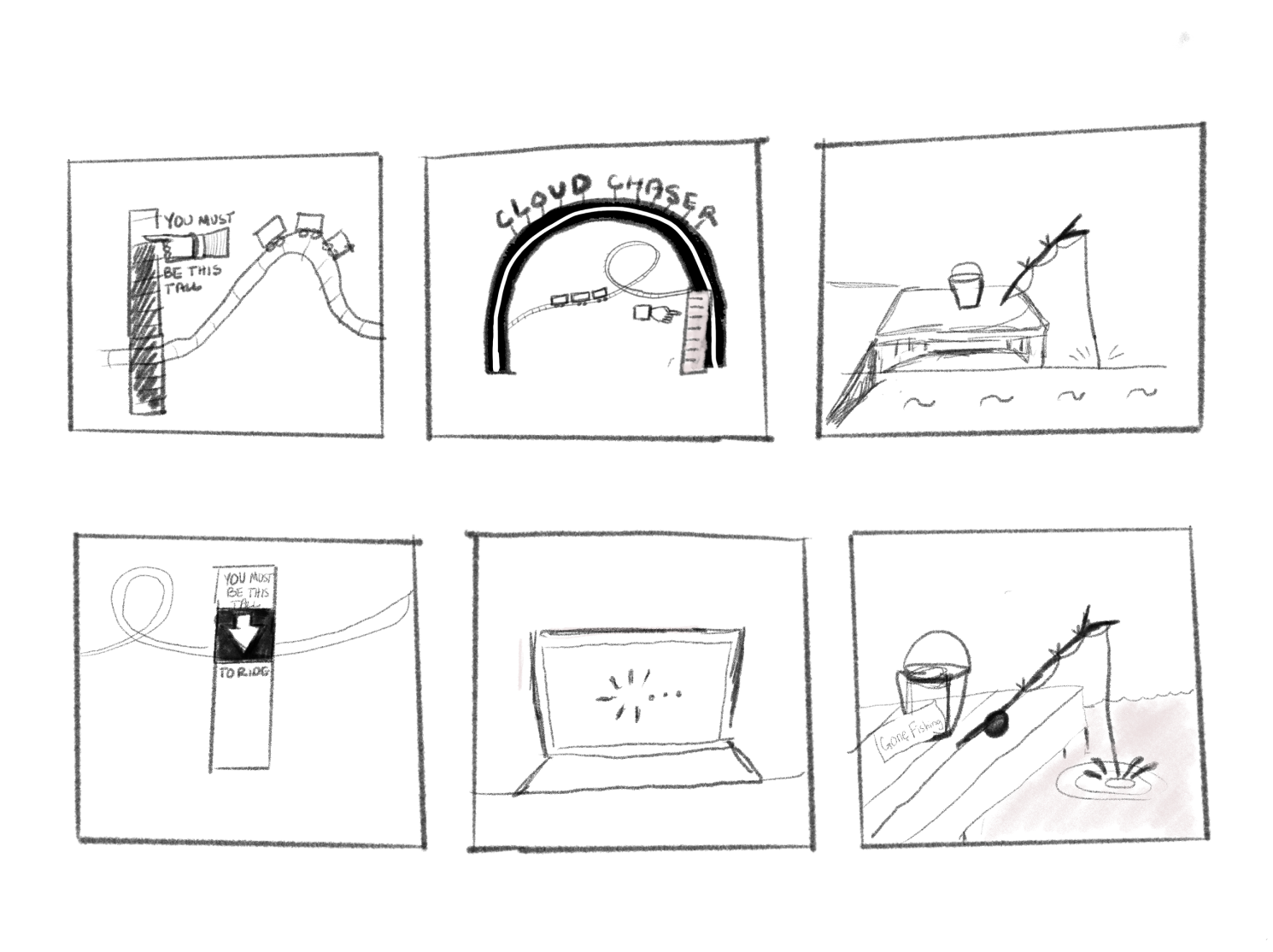
We decided to go with a more simple, straight forward concept for this empty state and illustrated different screens denying access to something.
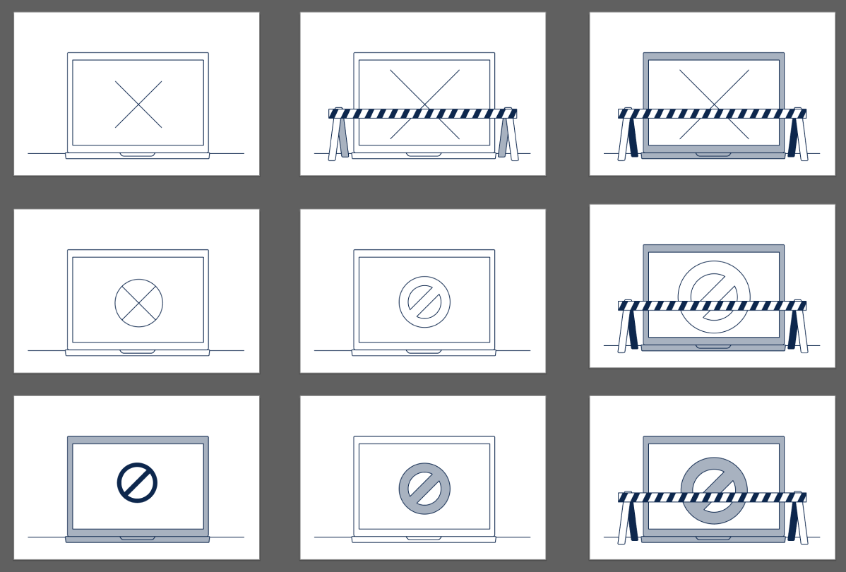
The sketches above were still lacking something, so we took a step back and illustrated a scene at a desk and played with different levels of complexity.
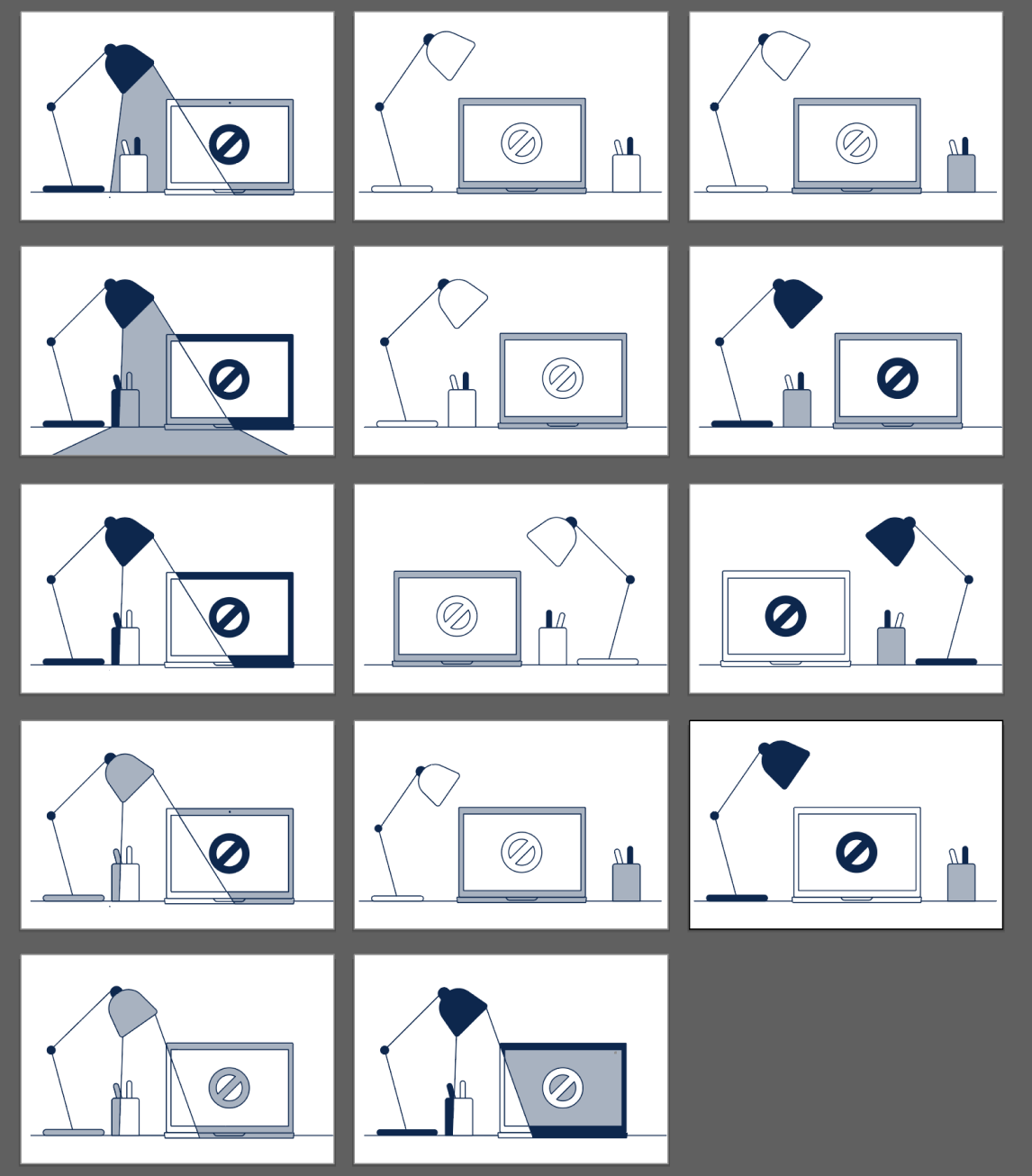
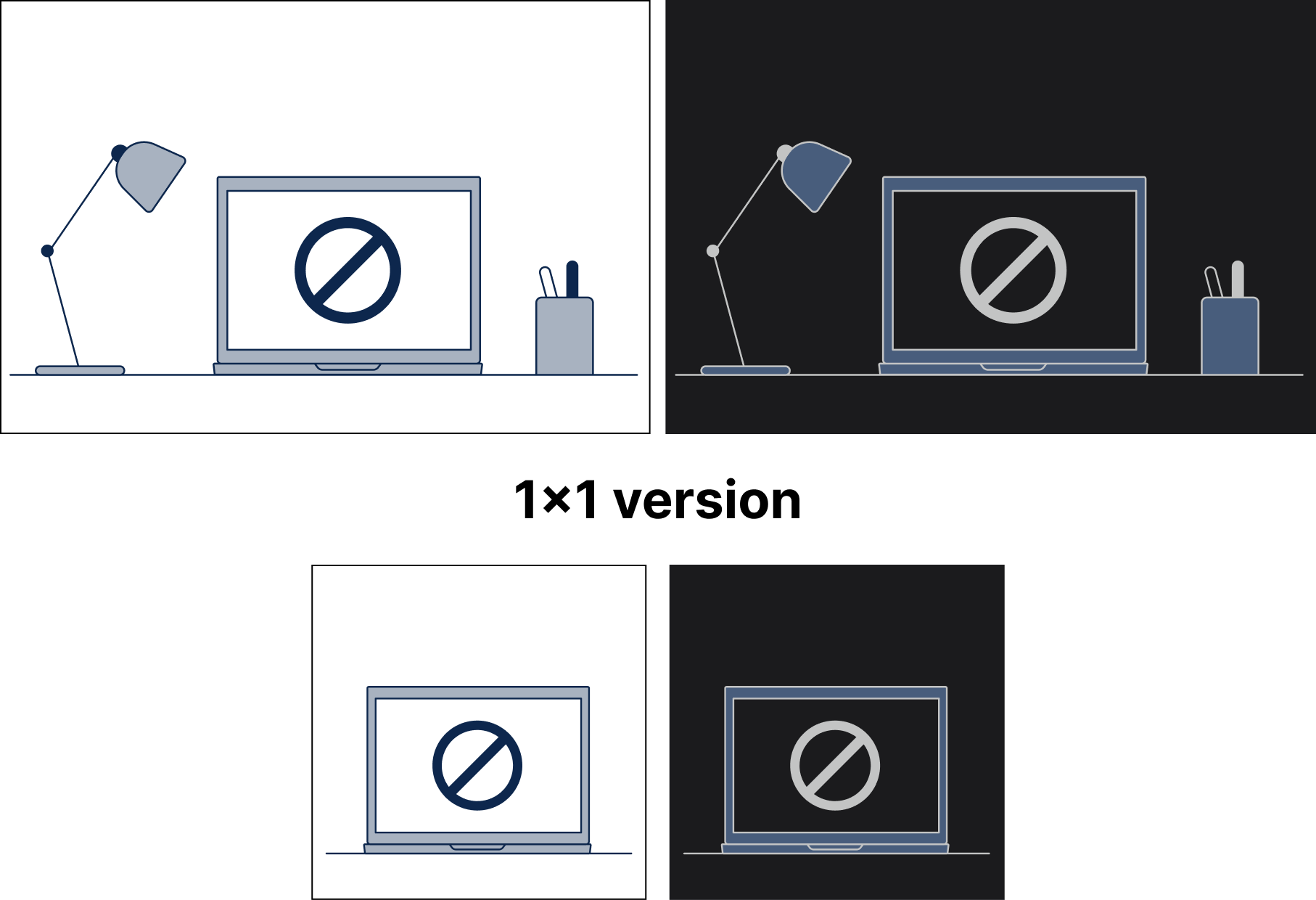
The final illustration remains simple so that it can be used in a variety of different applications. We created a dark theme version of this illustration as well as an abbreviated version of it to use in smaller applications.
We needed an error state for when there were no search results or ‘nothing found’ to be used within our Cisco IT pages.
Some of the first concepts for the ‘nothing found’ empty state included a raccoon in an empty trash can, a cow being abducted by aliens, and a desert scene.
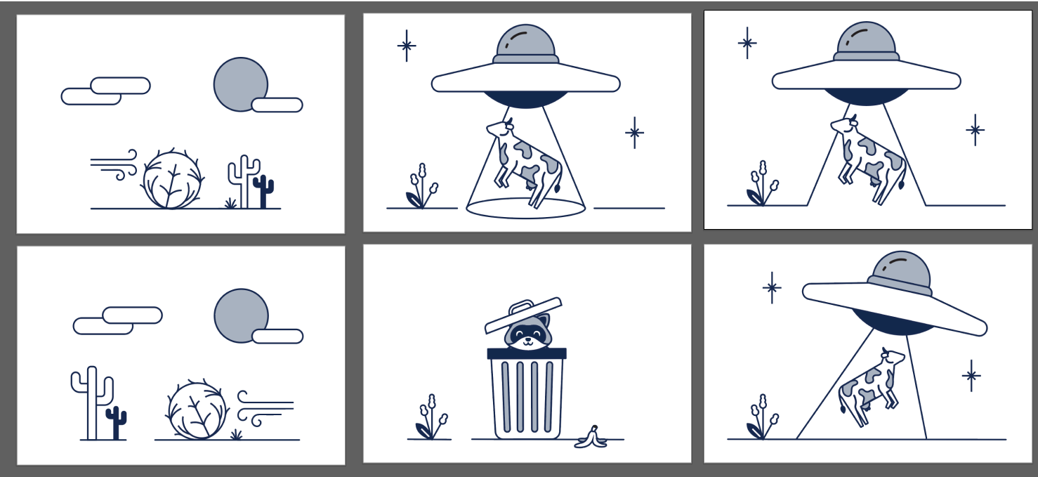
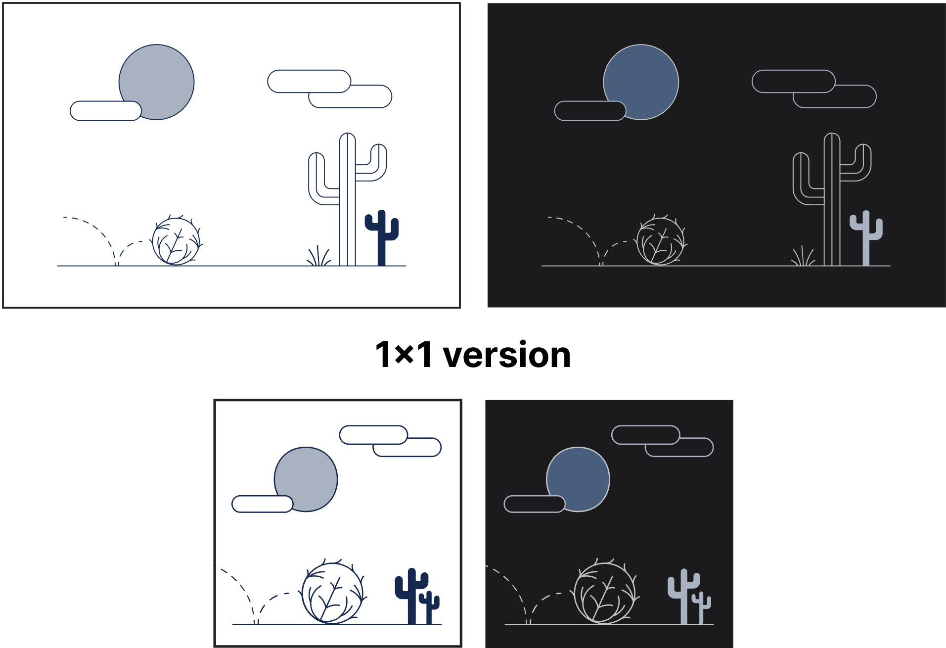
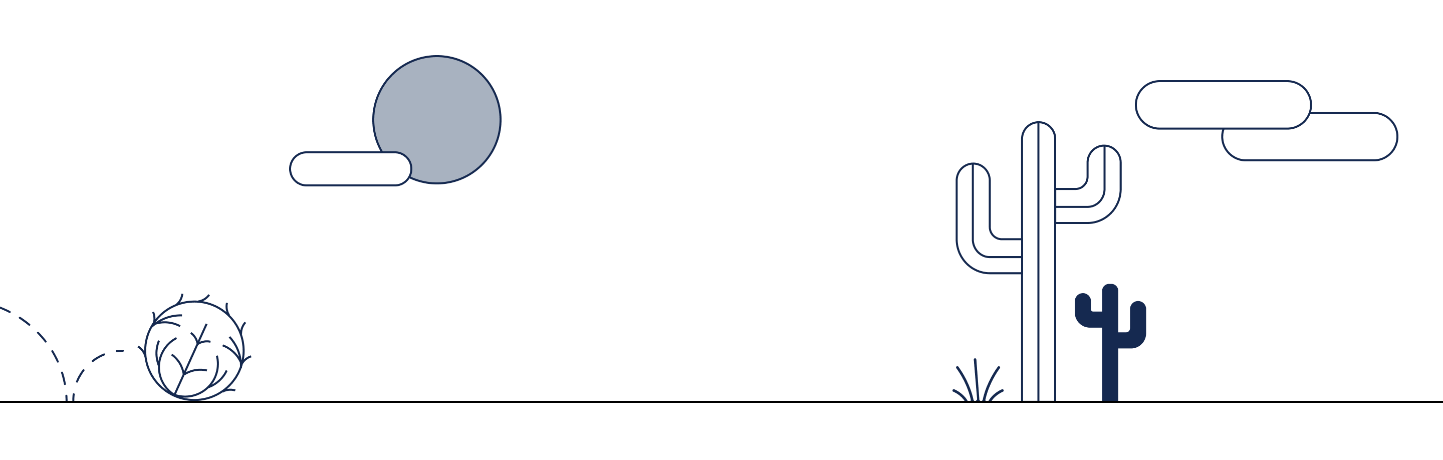
We decided to go with the desert scene and expanded more on the concept of a tumbleweed floating across the page to symbolize ‘nothing here.
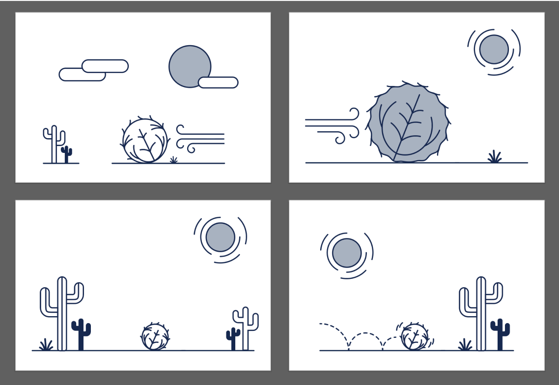
The final illustration represents a desert scene, with a tumbleweed bouncing across the screen to symbolize to the user that nothing was found. We created a dark theme and a 1x1 version as well.