compare packages
zenbusiness project
The team was tasked with coming up with a set of tests to provide our customers with an easier way to compare packages while they’re in the funnel.
overview
key responsibilities
- ideate on best ways to introduce a way to compare packages
- collaborate with content designer
- wireframe and prototype designs
- work with developers to construct designs
- conduct user testing with stakeholder team
- implement feedback
my role
product designer
collaborators
- Caitlin Moore - content designer
- Nelson Hsu - product manager
- Elizabeth Marks - ux researcher
ZenBusiness provides a way for users new to starting a business to easily sign up for a create an LLC with all the supporting materials you need to get your business up and running. In the current new user flow, there is no way to easily compare packages to make an informed decision on the best package for the individual.
The current user tests captured with Microsoft Clarity show that users have a hard time going back and forth trying to compare the different packages ZenBusiness offers. Thus, leading the user to abandon the funnel and go somewhere else.
I was tasked with coming up with a solution to make it easier for the user to compare the different packages offered and make an informed decision without needing to leave the funnel.
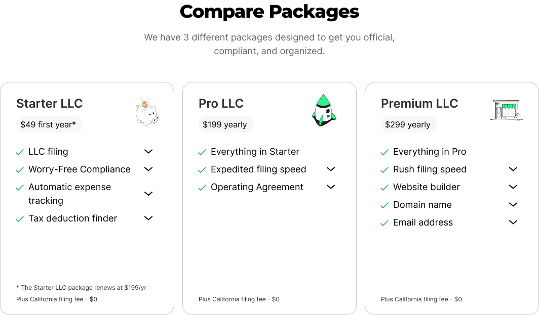
The first presented option would put 3 tables, one for each package into a side-by-side comparison. The table would pop open in a separate module, so it’s out of the way those who may not want to see it, but still there for those that do want the option to compare.
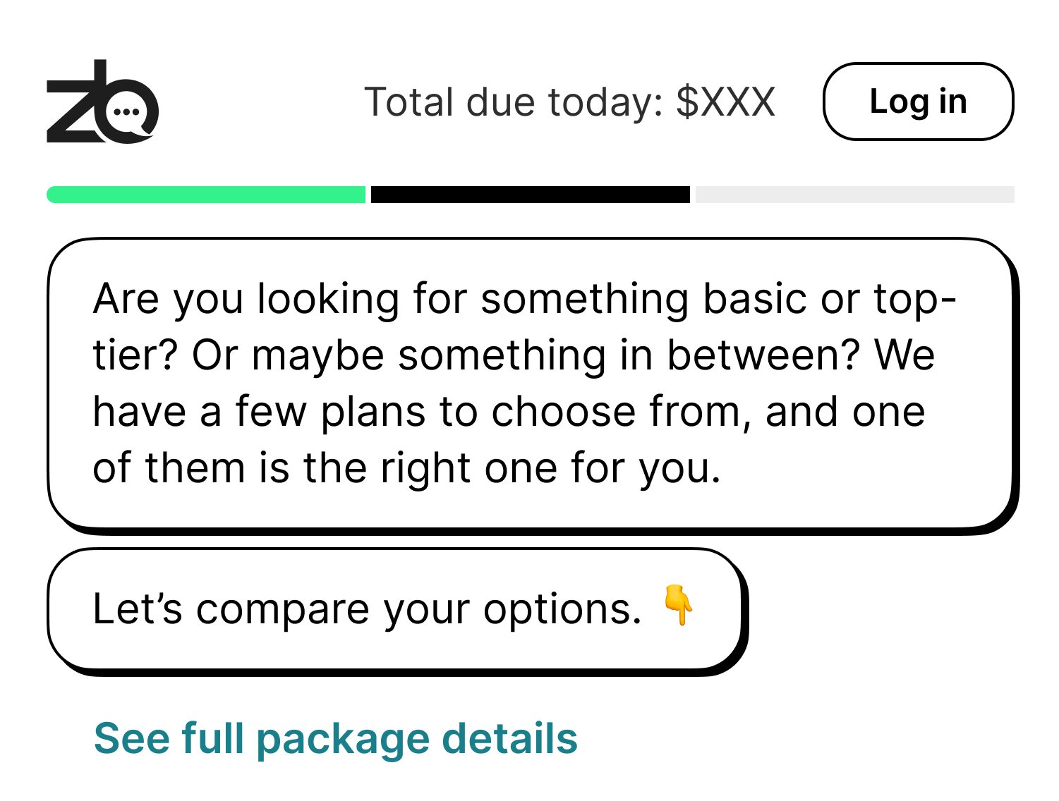
The second presented option would be a module that pops open with a single card. Pro (the recommended package) would be the default selected, with the starter and premium on their respective sides. The list would grey out and un-check any items that aren’t included in the package, with an option to expand upon the info for each.
The tests were put through user testing first, where we tested to make sure the user would know how to open and close the module presented in both solutions. The results were a 100% positive response rate. Both of the tests then went through A/B testing where they were overall more successful than the control.