pirate's booty colors
amplify snack brands project
The Pirate’s Booty team sought a compelling strategy to promote their innovative snack variant, distinguished by vibrant colors derived from natural plants. In addition to this, we were tasked with crafting a product that could make a splash in the Easter snack market, while also possessing the versatility to maintain a year-round appeal.
overview
key responsibilities
- Ensure that the packaging design aligns with the overall brand identity and messaging.
- Gain a deep understanding of the product, its features, and its target audience to inform the design approach.
- Generate creative concepts for the packaging that resonate with the product and appeal to the target market.
- Develop custom illustrations or incorporate existing ones to enhance the visual appeal and uniqueness of the packaging.
- Ensure that the packaging complies with relevant regulations, including label requirements, nutritional information, and legal disclaimers.
- Have a good understanding of different packaging materials and printing techniques to optimize design for production.
- Conduct or participate in consumer testing to gather feedback on the packaging design's effectiveness and appeal.
my role
packaging designer
graphic designer
illustrator
collaborators
- Joanie Cahill - design manager
- Shannon Mckenna - graphic designer
The team undertook the challenge of designing packaging that harmoniously complemented the vibrant hues of the new colored Pirate’s Booty. Although intended for an Easter market release, our objective was to strike a balance—avoiding an overly Easter-themed look to ensure the product seamlessly integrates into the everyday lineup of Pirate’s Booty.
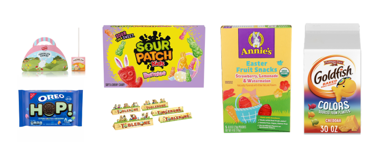
To gain insights into the Easter snack market landscape, we conducted a comprehensive analysis encompassing both competitor brands and others in the consumer packaged goods category. While a majority showcased an Easter-centric theme, notable exceptions like Goldfish embraced a year-round colored variety. Across the category, we observed a prevalent use of vibrant pastel colors, lush grass imagery, and nature-inspired touches defining the visual language of these snacks.
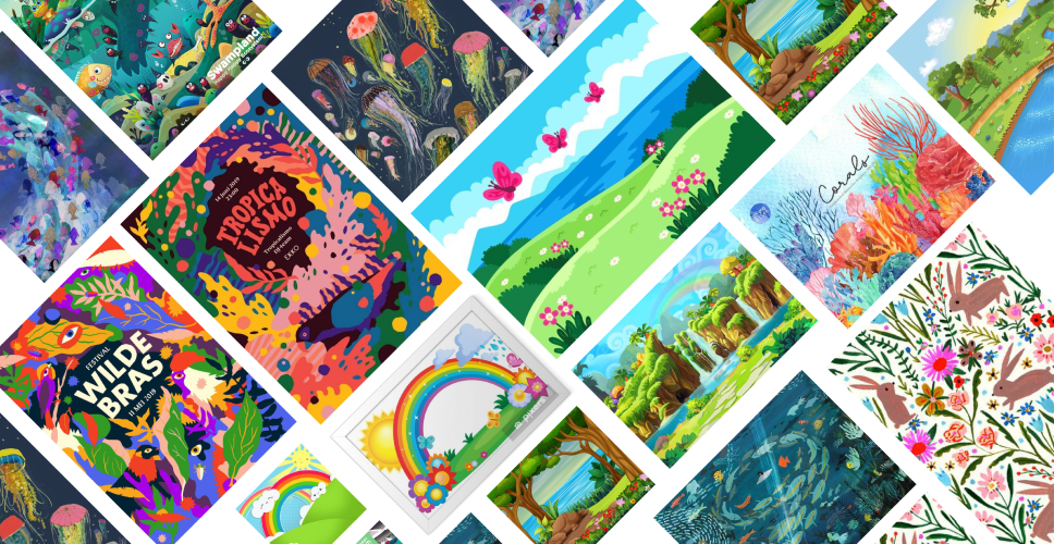
Prior to embarking on the design for the new package, we curated a vibrant mood board teeming with lush imagery and nature-inspired elements. Our vision was to infuse the packaging with a strong nature influence, effectively communicating that the product derives its striking colors from natural plant sources.
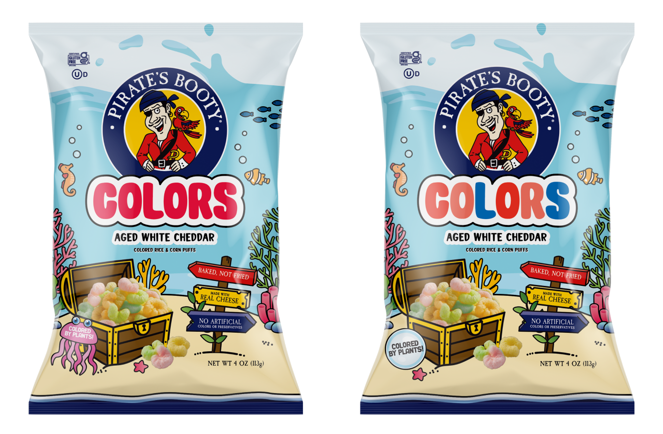
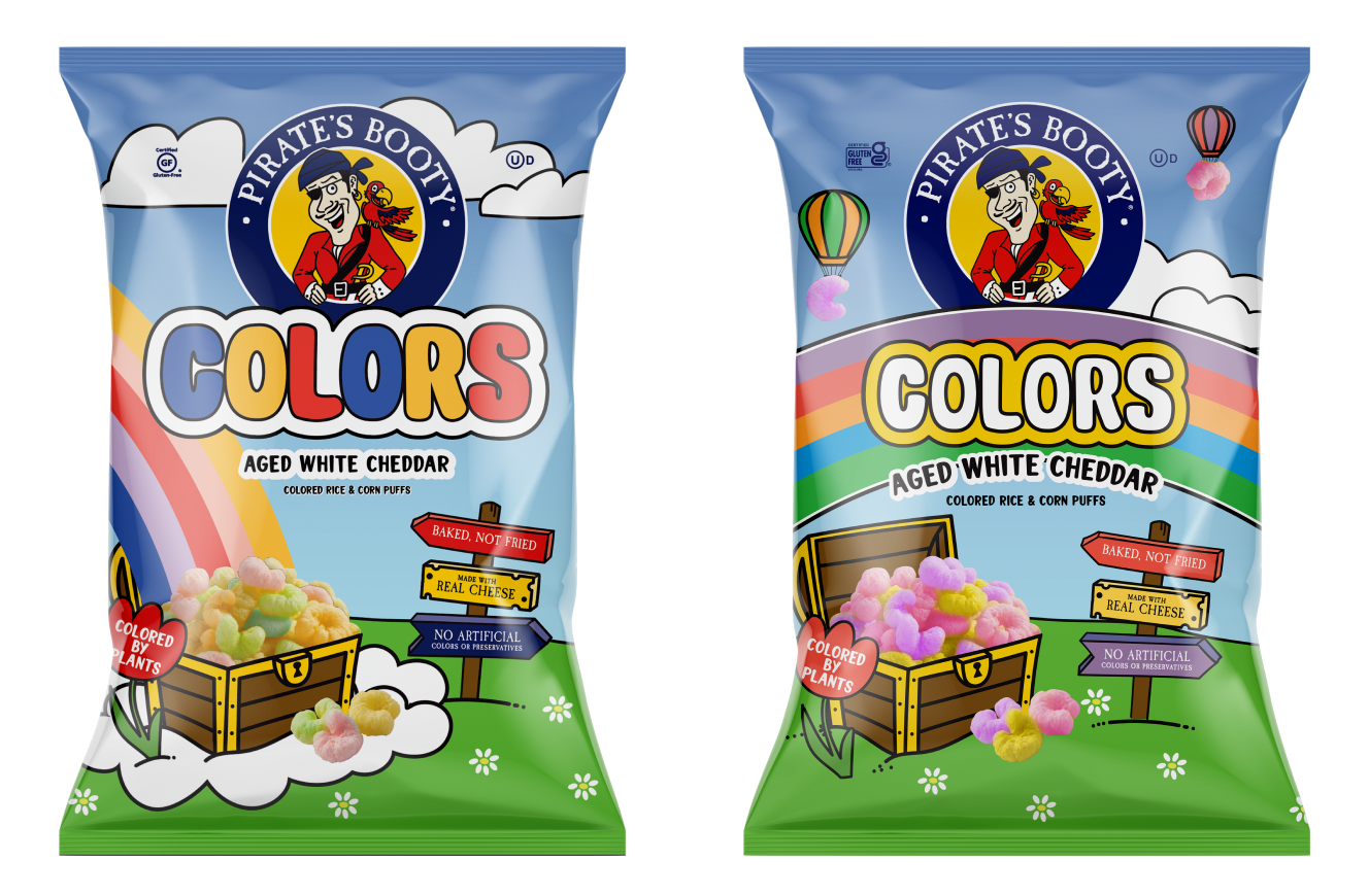
Our initial approach involved embracing the captivating theme of pirate's treasure, delving into the rich palette of natural, vibrant colors found underwater, inspired by the enchanting hues of coral and sea life.
The second solution delved into the world of rainbows, drawing inspiration from the spectrum of colorful, vibrant grasses, and flowers. Our goal was to infuse the product with the allure of a treasure awaiting at the end of the rainbow.
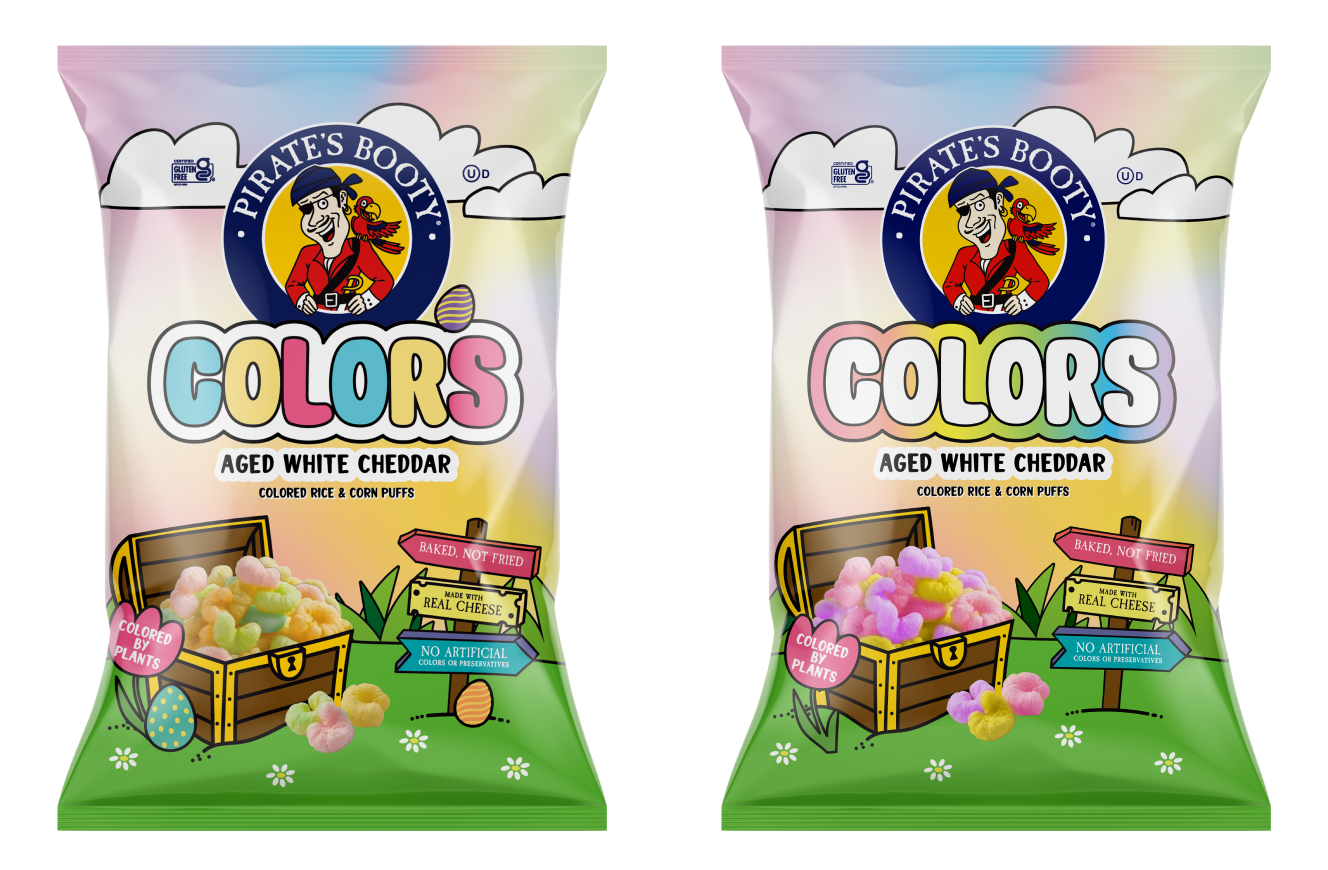
In our third approach to crafting the package design for this product, we veered towards capturing the colors of the Easter market, drawing inspiration from established brands in the seasonal category. Within this framework, we explored two avenues: one featuring the inclusion of eggs nestled among the grass and Pirate’s Booty, and the other opting for a more subtle yet charming pastel palette reminiscent of Easter-like colors.
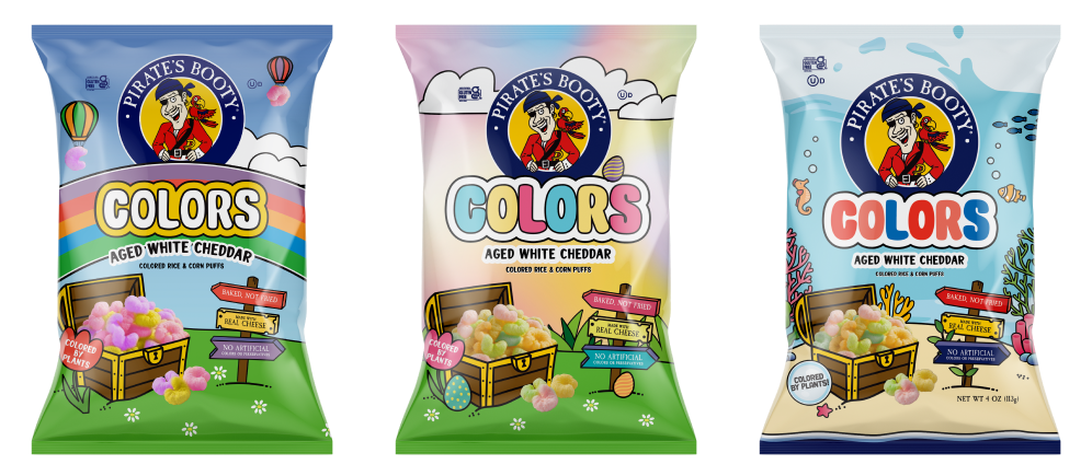
The next phase in shaping the packaging for this product involved subjecting our mockups to user testing, allowing consumers to select the packaging that resonated most with them.
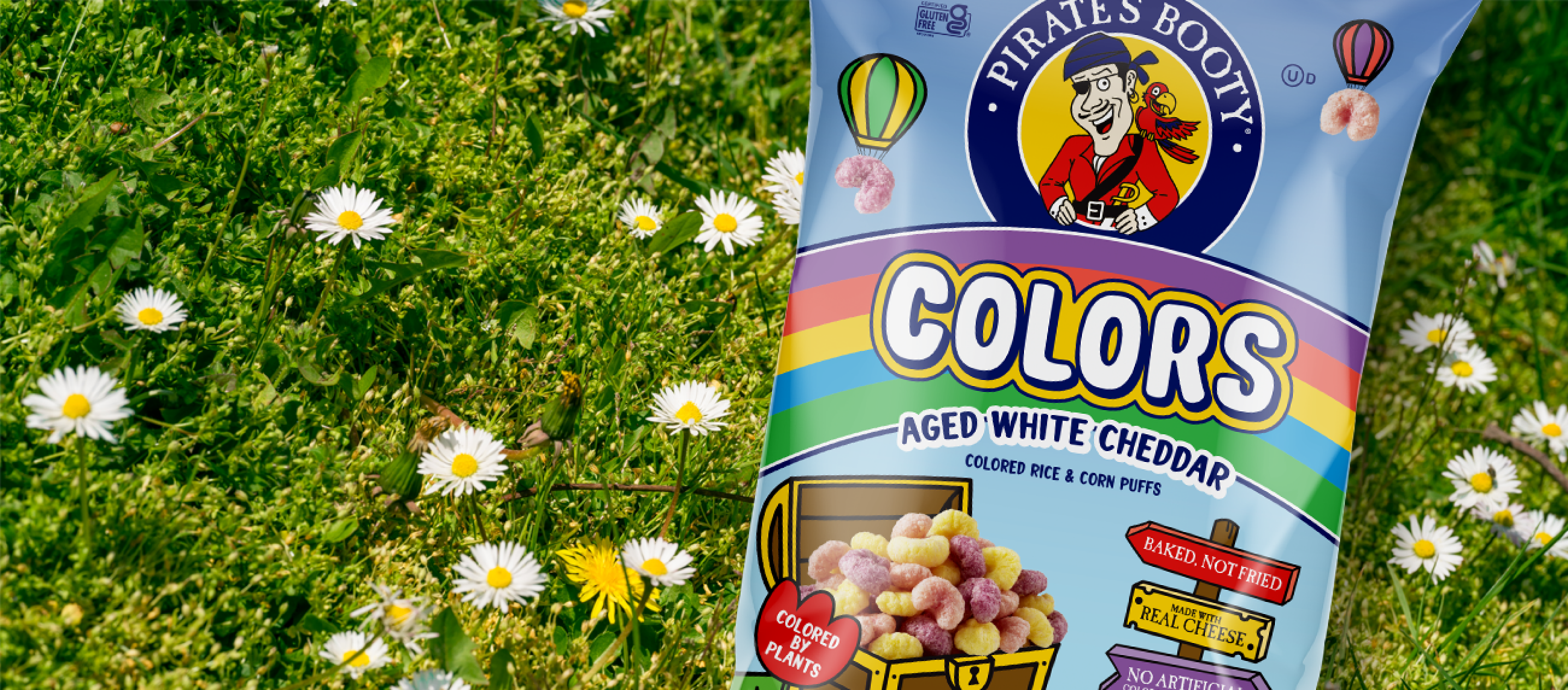
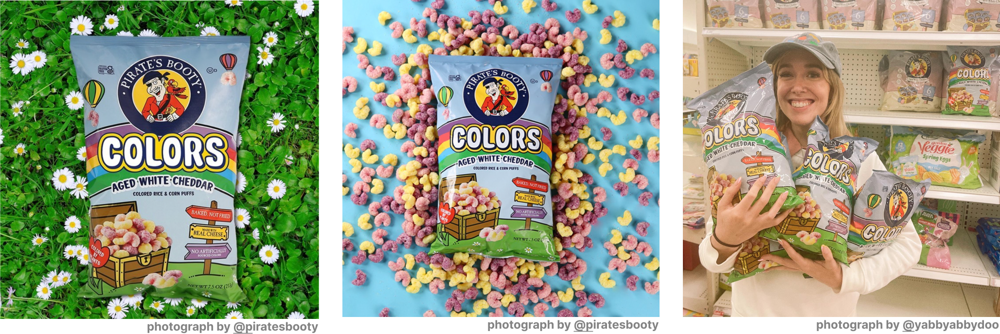
The ultimate packaging design is defined by a sweeping rainbow as its overarching theme, enveloping the title 'Colors' within its vibrant arc. The iconic chest brimming with Pirate’s Booty takes center stage, offering a treasure at the end of the rainbow. To accentuate the product's natural coloring, we incorporated bursts of colorful flowers, with the tagline 'Colored by Plants' elegantly nestled within a floral motif. As an extra flourish, hot air balloons crafted from Pirate’s Booty drift through the air, playfully filling any remaining space.
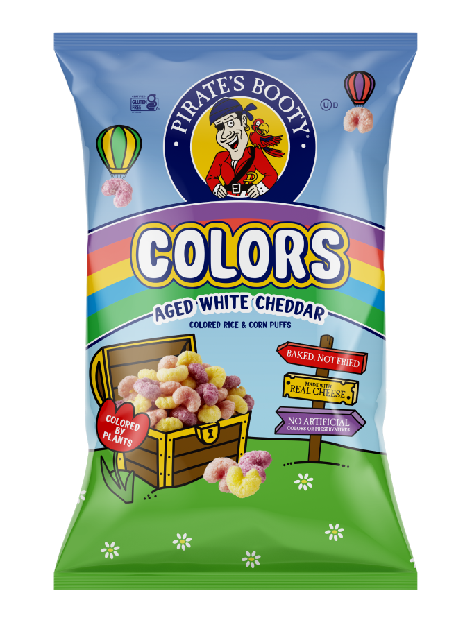
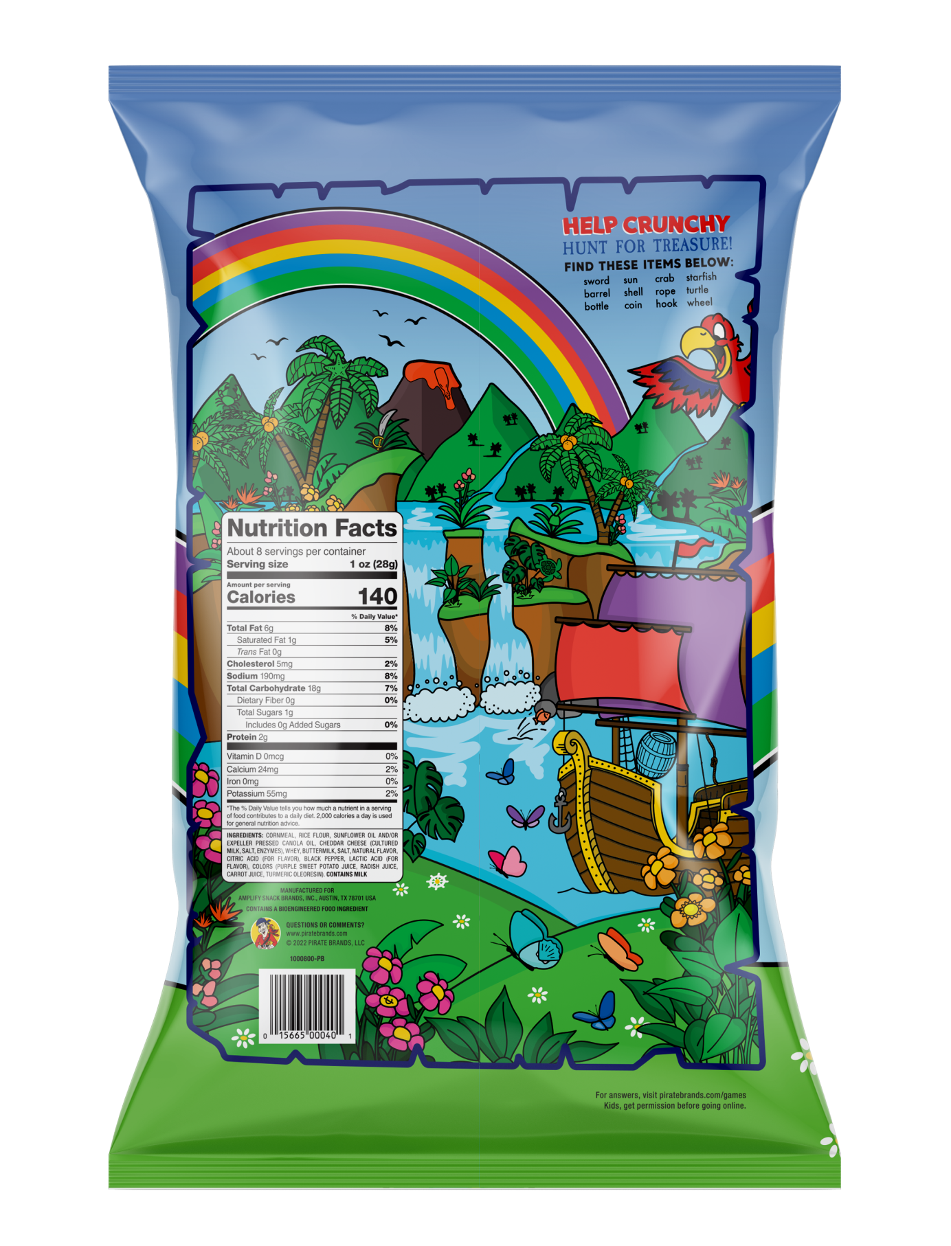
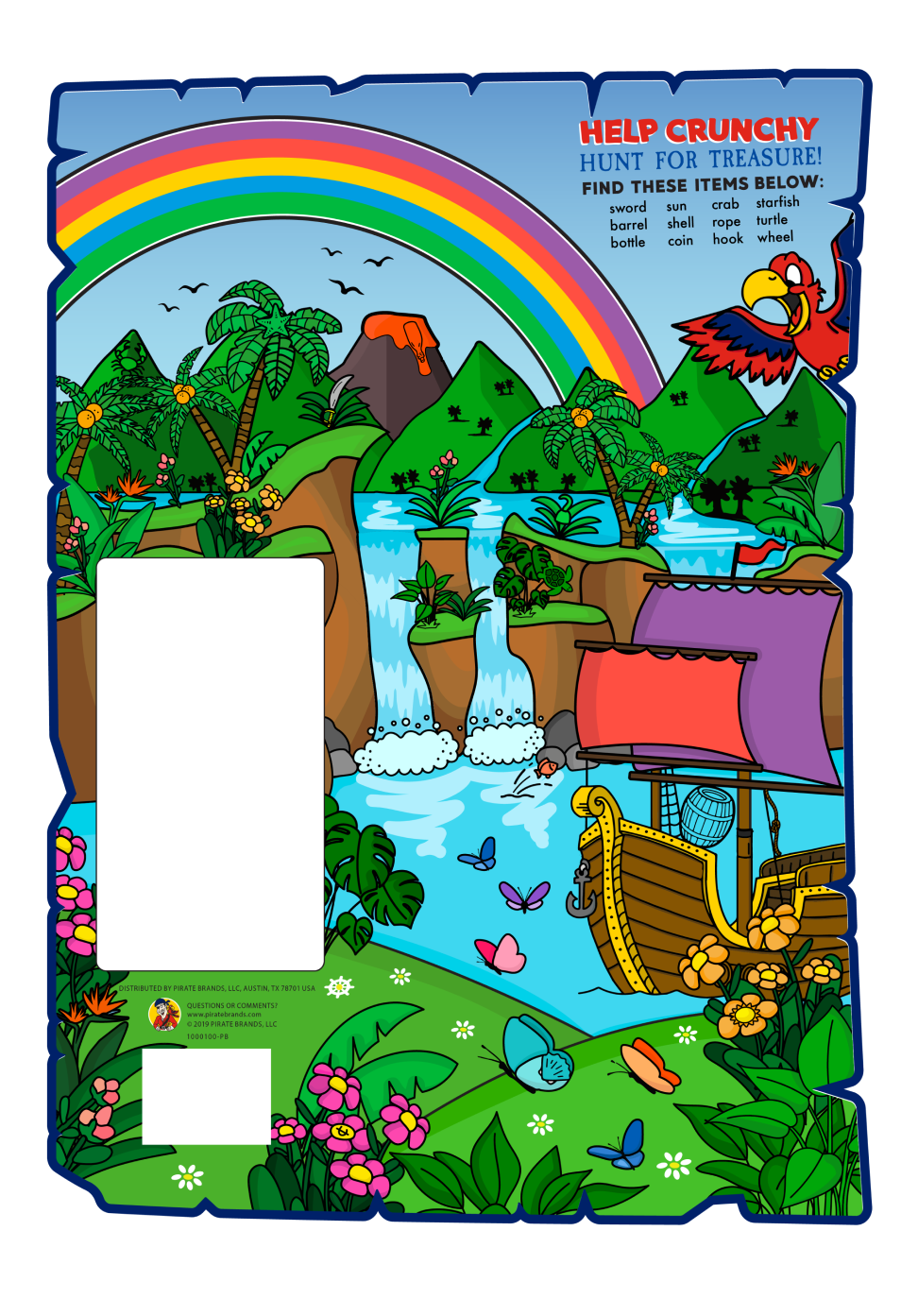
Pirate's Booty has earned acclaim for its captivating 'back of pack' details, often featuring engaging puzzles for audiences to decipher. In crafting this illustration, I aimed to amplify the color theme by seamlessly extending the rainbow from the front of the pack, creating a luxuriant and vivid scene of concealed objects for audiences to delight in discovering.
While Pirate’s Booty 'Colors' enjoyed a brief stint, exclusively released during Easter, the experience of working on this product was truly gratifying.