cheddar blast
amplify snack brands project
Pirate’s Booty sought a fresh spin-off package design for their irresistibly cheesy snack line. I undertook the responsibility of innovating the brand lineup, introducing lively and engaging packaging concepts that seamlessly extended the brand while maintaining a harmonious consistency with the core identity.
overview
key responsibilities
- Ensure that the packaging design aligns with the overall brand identity and messaging.
- Gain a deep understanding of the product, its features, and its target audience to inform the design approach.
- Generate creative concepts for the packaging that resonate with the product and appeal to the target market.
- Develop custom illustrations or incorporate existing ones to enhance the visual appeal and uniqueness of the packaging.
- Ensure that the packaging complies with relevant regulations, including label requirements, nutritional information, and legal disclaimers.
- Have a good understanding of different packaging materials and printing techniques to optimize design for production.
- Conduct or participate in consumer testing to gather feedback on the packaging design's effectiveness and appeal.
my role
packaging designer
graphic designer
illustrator
collaborators
- Joanie Cahill - design manager
- Shannon Mckenna - graphic designer
The Pirate’s Booty marketing team approached the design team with a concept for an extra cheesy line. We needed to come up with the naming for the product and the packaging for the new subset of snack.
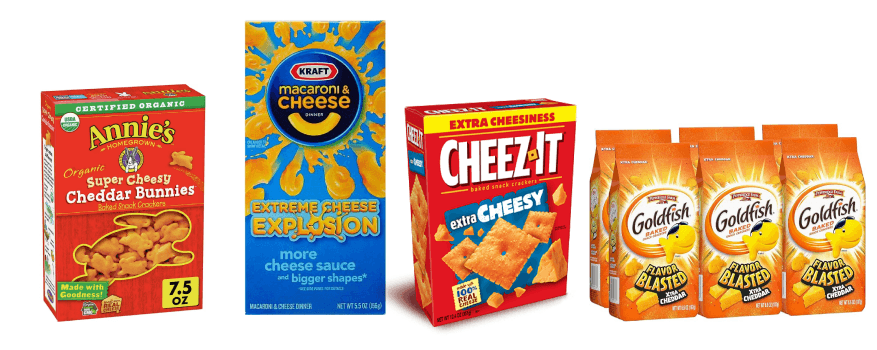
To craft a strategic approach to the new branding, we delved into comprehending market trends by scrutinizing various iterations of extra-cheese product lines among competitors in the salty snack category. Our analysis extended beyond our immediate industry, encompassing a diverse range of 'extra cheese' products to glean insights into how they effectively conveyed the extra cheese element.
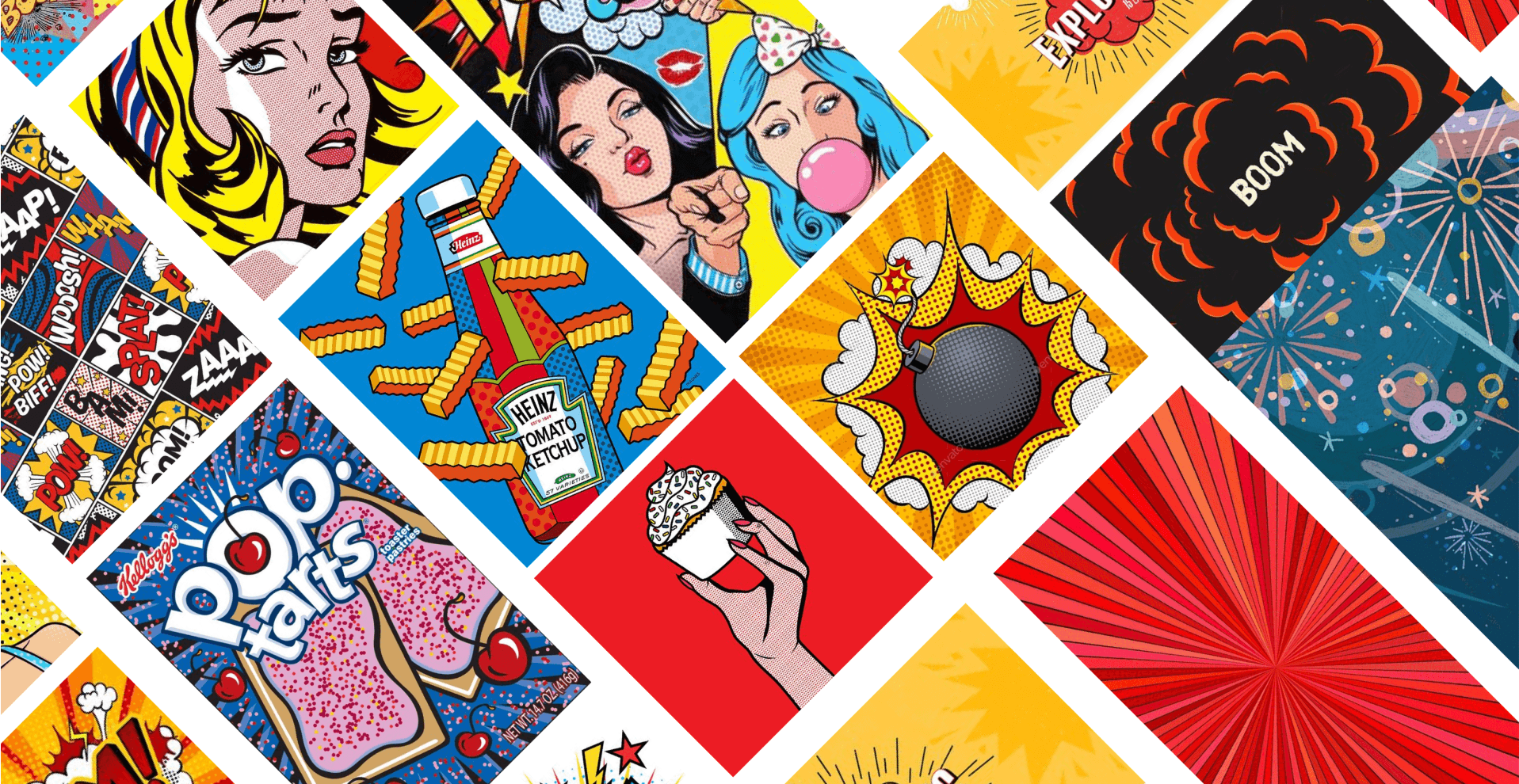
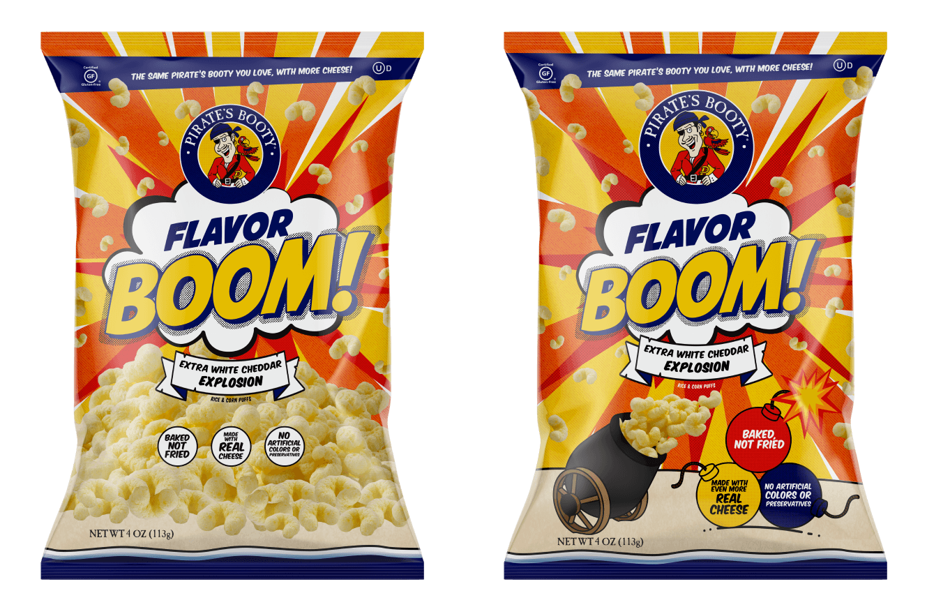
Our preliminary concepts for package design drew significant inspiration from the dynamic world of comic books, featuring explosive visuals and vibrant fireworks. We were particularly enamored with the pop art aesthetic, appreciating how shapes could effectively communicate onomatopoeic elements, lending a visually compelling and energetic appeal to the overall design.
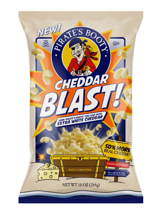
In our initial design iterations, we introduced lively bursts of color and graphical elements inspired by our mood board. We embraced the concept of naming the product 'Flavor Boom' to vividly convey the cheesiness of the snack. We retained the original border, opting for a smaller logo to create ample space for the captivating 'boom' element. Furthermore, we introduced a 'Mild to Wild' scale, initially featuring the iconic chest from the main packaging, but also exploring alternatives like a cannon or a generous pile of the Pirate’s Booty.
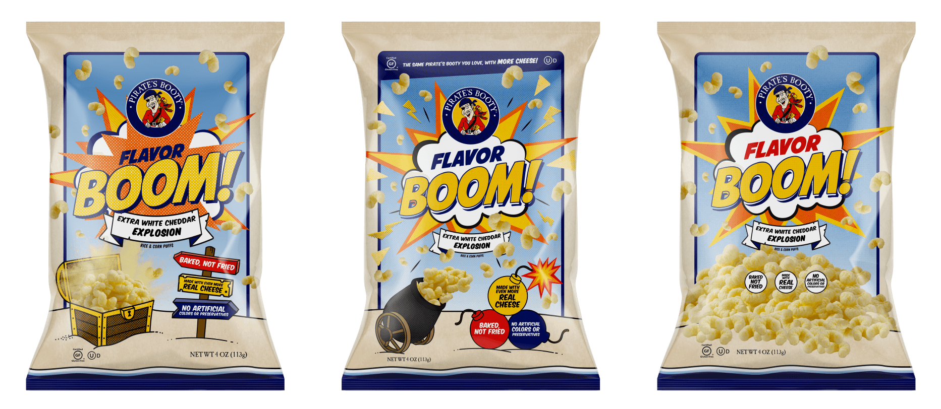
Our wild packaging variant embraced a riot of vibrant colors, drawing inspiration from the lively and explosive backdrop found in comic books. We delved deeper into the thematic elements, refining the design of the cannon and explosives to heighten the visual impact.
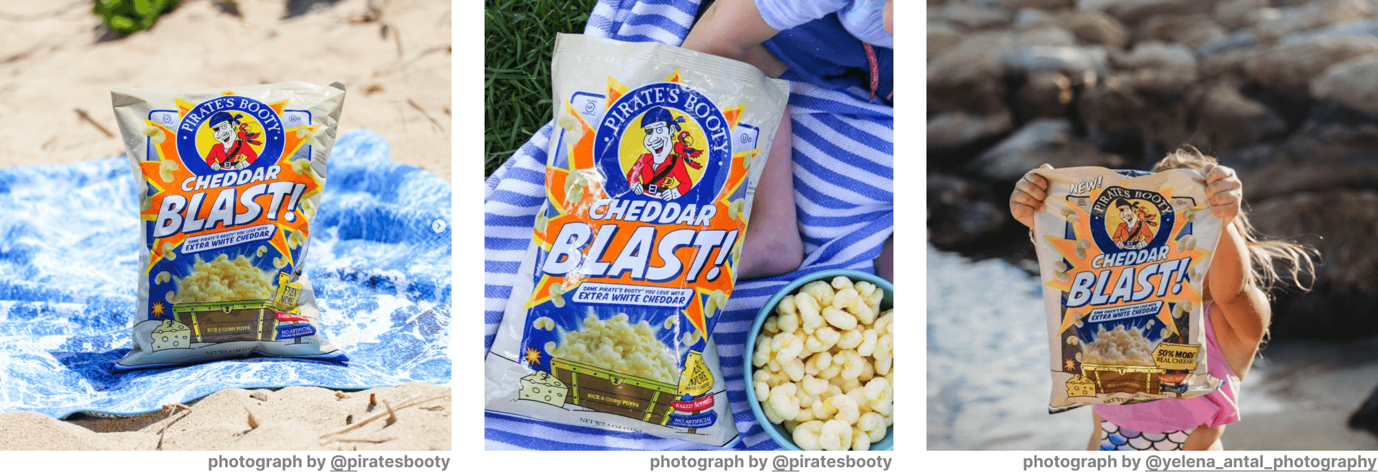
We subjected several of the aforementioned packaging solutions to user testing, allowing participants to select their preferred design—choosing the one that captivated their attention and seemed most likely to prompt a purchase. This strategic approach aids us in gaining an understanding of our audience, providing valuable insights into their preferences and guiding us towards a more informed decision on the final packaging.
Our ultimate solution evolved, informed by user feedback and deliberate design refinements. We retained the captivating, explosive comic-book aesthetic, enhancing it with subtle touches such as the inclusion of halftone patterns and text reminiscent of comic-book styling. To emphasize the cheesy nature of the product, we introduced visuals of Pirate's Booty bursting out of the chest, surrounded by a cascade of cheese dust.
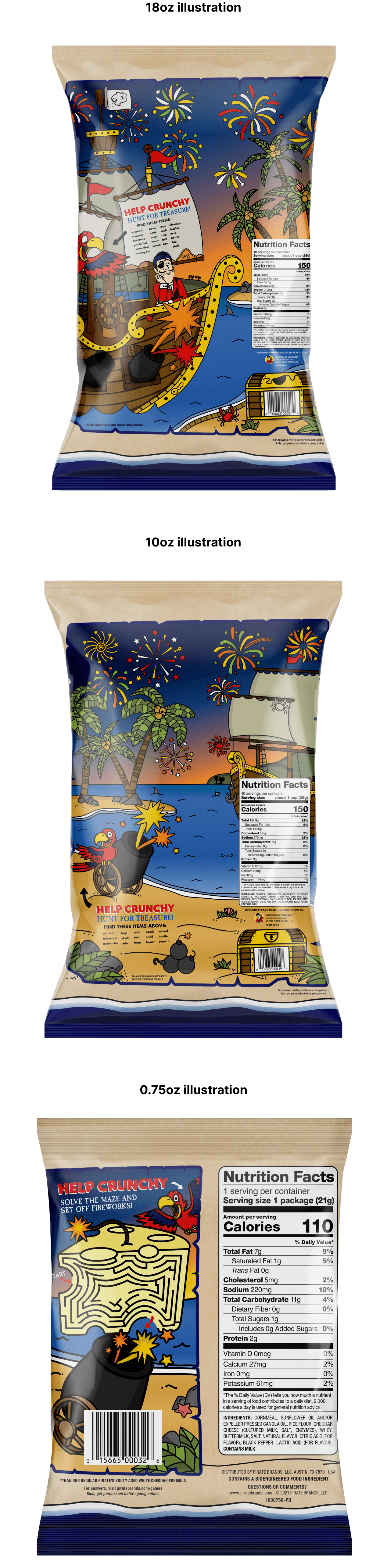
For Pirate's Booty, we recognized that the delight for children often resides in the overlooked Back of Pack, typically reserved for nutrition facts. We extended the explosive theme by crafting an illustration where our brand mascots gaze at a night sky ablaze with fireworks. To captivate our audience, we concealed items within the scene, transforming it into an engaging seek-and-find experience.
This project was an absolute joy to work. In the end, we arrived at a design that has not only endeared itself to the audience but has also swiftly earned a cult-favorite status.